MTR Moments

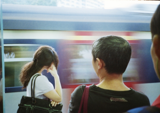
I suppose these are not the most technically accomplished of photographs.

Yet there are times when technicality takes a backseat – you could have a technically perfect photograph that is meaningless.
IMG_20131029_0039 A3 A4 640

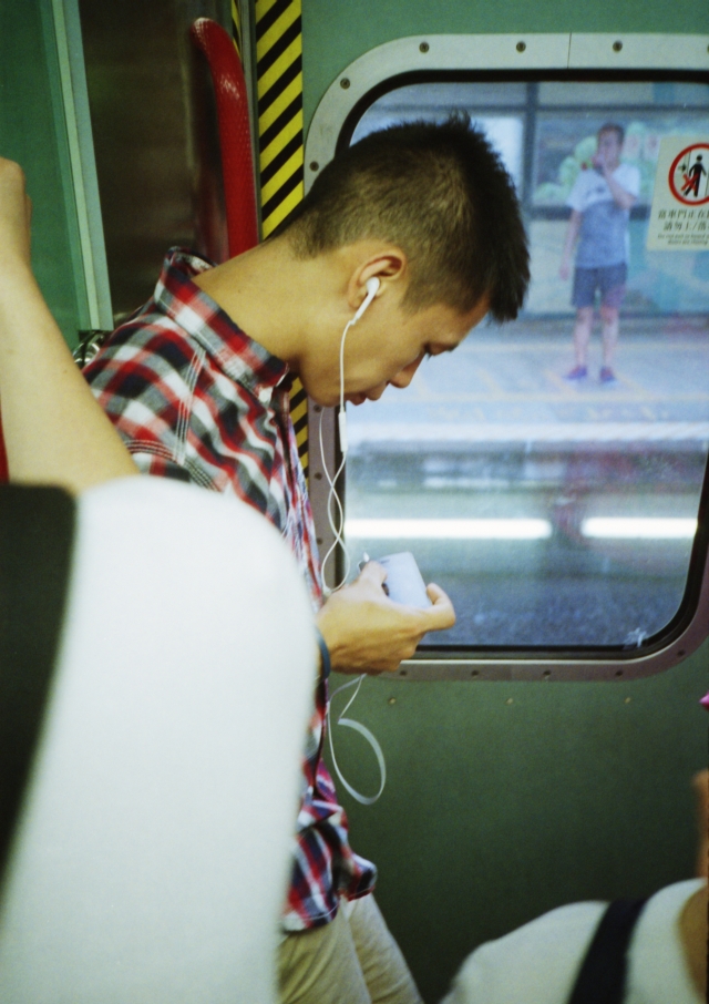
Here, we’re reminded of how street photography is an art that requires a seat-of-the-pants attitude. Sometimes it’s about serendipity and stealth and being “in the zone”.
IMG_20131029_0040 A3 A4 640

There’s not much to say about the composition in the above photograph.

Perhaps I’m forgiving myself too much, yet the imperfection says something of the constraints of the art in the particular environment.

I simply can’t really walk around and compose my shots in a train cabin as it would attract too much attention.

In any case, the cabin was crowded. Most of these people were about 1-2 metres away from me.

IMG_20131029_0038 A3 640

This person saw me without really registering what I was doing and turned away.

IMG_20131029_0035 A3 640

This person was too engrossed in his reading to notice.

It’s amazing how we switch off when we’re commuting.

IMG_20131029_0036 A3 A4 640

Yet I find these moments, moments when we’re lost in our thoughts, the most poignant of all.

IMG_20131029_0041 A3 A4 640

I didn’t think the above would work at first. I was thinking to myself at that moment that this was a wasted exposure.

I’m biased, of course, but now I think I’d rather like the artlessness of the composition.

IMG_20131029_0052 A3 A4 640

Again, not perfect. It’s not sharp enough.

At times like this, I take comfort in Henri Cartier-Bresson’s statement that “people think far too much about techniques and not enough about seeing” (The Mind’s Eye, p. 38).

Thanks for coming by today.
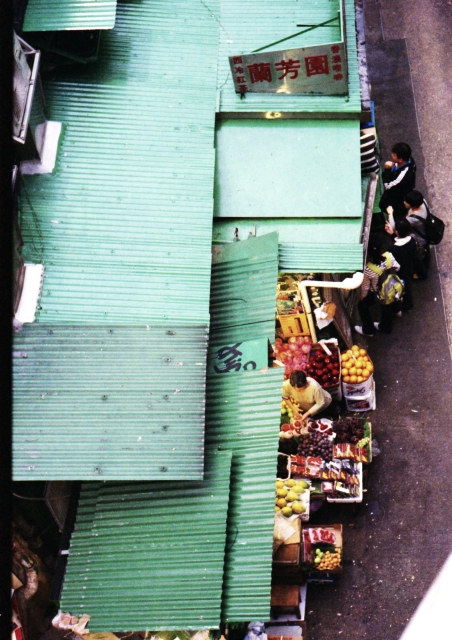
Street Market and Printing

Though all the images here are created with film cameras, they are of course scanned from negatives and ultimately, on display here are digitised images on a computer monitor.

IMG_20130913_0002 A3 adjusted A4 640

I’ve been experimenting with colours lately, having bought a dedicated pigment ink photo printer and various Ilford and Harman papers.

It really does make a difference whether the image is printed on glossy or on matte, etc. And of course, I am going to frame them up, now that I’ve finally gotten my hands on photo-safe tape.

Images like the one below work on both matte and gloss. On matte, there is a gritty look which fits in with the grungy seat-of-the-pants attitude of street photography.

IMG_20130913_0001 adjusted A3 A4 640

A colleague who used to paint commented that the matte print looks more like a painting than a photograph. He said there’s a Caravaggio framed-by-darkness quality to it.

On the other hand, the glossy print has what I think of as a “Nirvana in Carnegie Hall” effect… a refined “fine art” treatment to street photography.

IMG_20130913_0001_ adjusted A3 A4 640

I suppose glossy is good for portraying drama in ordinary scenes.

And now that I’ve got all of these, I’m now thinking of what I should do next. Where is this taking me?

Direction 1: Teaching and Research

A fascination with photography (and film cameras, I must admit) is now changing the way I work. I find myself making connections between photography and creative writing, between the history of art and literary history. Is there a homology between creative writers and photographers?

What would a university course on the connections between photography and literature look like?

I am now thinking of creating a course that is practice-based, one that encourages students to go out and explore HK culture using literary and non-literary writing and photography, and getting them to think about what constitutes valuable cultural knowledge.

I’ll probably throw social media (such as a WordPress blog like this) into the mix, getting them to think about the use of social media for sharing one’s work. And what is meant by “sharing”? What, really, is being shared? And what is “work”?

Direction 2:

This has all to do with the situation of one’s work, I suppose. Digital images live in one’s hard disks or are displayed on sites like this. Now that I have the physical prints on hand, perhaps the next step is to work towards a gallery exhibition.

It’s a kind of curating, I suppose, setting up one’s work for viewing …

IMG_20130906_0006 A3 adjusted A4 640

What kind of logistics and various other considerations would this involve? There’s a learning curve ahead of me …

What is becoming clear to me now though, is that this blog is like a thinking-in-progress technology, a depository of raw ideas… much like a building under construction …

IMG_20130913_0003 adjusted A3 A4 640

Thanks for reading.

Grids, lines and colours

I’m now convinced that Hong Kong is a street photographer’s paradise.

I’ve been paying attention to grids, lines and colours and it seems to me that all I have to do is wait a little bit and the composition would fall into place after a while.

Mongkok is rather good for that sort of thing.

For example, the rectangular green grids of this candy store window has a lomography edge to it, and all I had to do was to memorise where the framelines of my beloved Leica M6 would be and wait until someone walks into the frame. Check out the reflections and the Chinese characters – they’re there and yet not so overwhelming:

IMG_20130906_0003 A3 adjusted A4 640

The diagonal lines were calling out to me as I was on a bridge:

IMG_20130906_0002 A3 adjusted A4 640

And finally, I like the grungy and yet contemplative mood this evokes:

IMG_20130906_0002 640

And I’m keeping a close watch on my diminishing supply of Kodak Portra 400 film with which these were taken…

Thanks for coming by today.

Ode to Retail

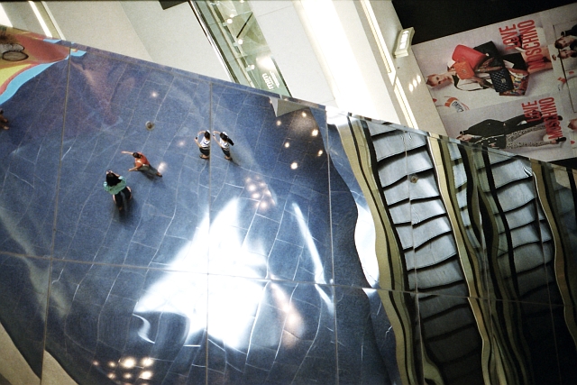
I don’t usually do color photography as I find it hard to “coordinate” the colors alongside the action in the frame. But the environment in this case seems to call out for it.

This was the beginning of a trip to Festival Walk, a shopping mall. My son wanted to pick up a few books at Page One. We sat at the front of a mini-bus.

IMG_20130827_0009 640 by 480

For those not familiar with Hong Kong: Festival Walk is a gigantic shopping mall with a skating rink and cinema. I often got lost the first few times I was here.

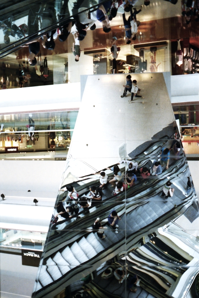
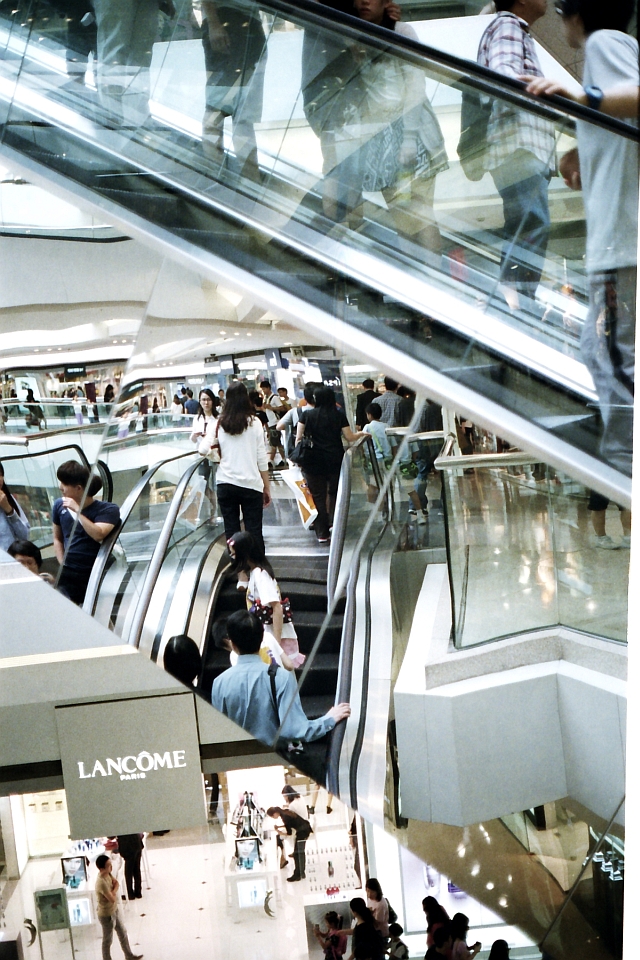
There are so many escalators and reflective surfaces. There is a fun house mirror effect every time we are on the escalators:

IMG_20130827_0025 640 by 480

We forget which way is up and which way is down…

IMG_20130827_0032 640 by 480

I think this is the point, that the design of malls are slightly disorienting so that the shopping experience feels slightly unreal. Our ability at making rational choices are somewhat incapacitated – we lose track of time and spend more than we had originally intended.

IMG_20130827_0034 640 by 480

I am reminded of a hotel called “Lotus Casino” in The Titan’s Curse, a novel in the Percy Jackson series, in which the characters were trapped. They were reluctant to leave the hotel because it was so fun. (The environment of casinos, of course, are meant to be unreal so that the chips [money] you’re losing look inconsequential anyway because you are just playing a game of Monopoly.) I’m thinking of those casinos in Macau now, especially the Greek Mythology Casino, complete with a gigantic statue of Zeus…

Here, the literary scholar in me is reminded of Fredric Jameson’s discussion of the Westin Bonaventure Hotel, about how the postmodern architecture is tied in with the (totalitarian?) logic of late capitalism.

It’s so easy in the mall. We look and point and buy:

IMG_20130827_0035 640 by 480

Everything is on show and so very photogenic, and the unreal becomes part of the experienced reality we consume and hence take for real:

IMG_20130827_0028 640 by 480

I almost forgot to leave.