A few colours here are worth mentioning.

Red.

Some more red.

Green.
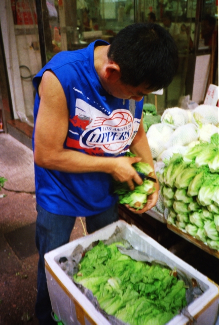
Some more green.

Don’t forget the blue.
And it’s back to red again.
Camera: Olympus XA 3
Film: Kodak UltraMax 400
A Thinking Street Photography Site
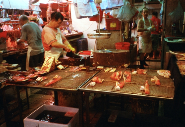
A few colours here are worth mentioning.
Red.
Some more red.
Green.
Some more green.
Don’t forget the blue.
And it’s back to red again.
Camera: Olympus XA 3
Film: Kodak UltraMax 400
Sometimes, mistakes can be surprising.

The focus is off, but the colours are there. There’s some kind of neon lighting that is projected onto the ceiling which changes every 10 seconds or so.
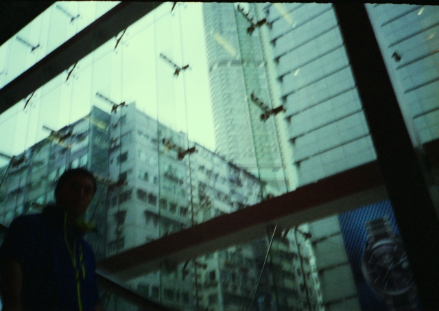
The above and below are taken in a shopping mall at TST near my church. No prizes for guessing which.
I was on an ascending escalator, trying to focus on those buildings outside the glass window and the gentleman entered the frame, descending from top left. It’s underexposed so we can’t really see the person, but the repetitions of the grid and the colours are there. The metal fasteners (is that what they’re called?) look like flying seagulls.
I’m not sure what went wrong with the photograph below. I think there’s motion blur and it’s overexposed… I don’t remember making this mistake…
I do this every Sunday on my way to church, to the taxi driver when he’s paying the toll at the Lion Rock tunnel.

In all honesty, I’ve done a bit of post-processing to heighten the colours. But I’ve spend no more than 3-5 minutes on each, simply going along with what the images are telling me, and only with levels and curves with the generic software that came with my scanner.
I suspect they’ll look gorgeous when printed with textured paper and mounted on non-glare glass.
Now I’m beginning to see the appeal of lomography, which is essentially about creating something beautiful from intuition, serendipity and “errors”. That’s the kind of artlessness in photography I’m drawn to…
Thanks for reading.
Though all the images here are created with film cameras, they are of course scanned from negatives and ultimately, on display here are digitised images on a computer monitor.
I’ve been experimenting with colours lately, having bought a dedicated pigment ink photo printer and various Ilford and Harman papers.
It really does make a difference whether the image is printed on glossy or on matte, etc. And of course, I am going to frame them up, now that I’ve finally gotten my hands on photo-safe tape.
Images like the one below work on both matte and gloss. On matte, there is a gritty look which fits in with the grungy seat-of-the-pants attitude of street photography.

A colleague who used to paint commented that the matte print looks more like a painting than a photograph. He said there’s a Caravaggio framed-by-darkness quality to it.
On the other hand, the glossy print has what I think of as a “Nirvana in Carnegie Hall” effect… a refined “fine art” treatment to street photography.

I suppose glossy is good for portraying drama in ordinary scenes.
And now that I’ve got all of these, I’m now thinking of what I should do next. Where is this taking me?
Direction 1: Teaching and Research
A fascination with photography (and film cameras, I must admit) is now changing the way I work. I find myself making connections between photography and creative writing, between the history of art and literary history. Is there a homology between creative writers and photographers?
What would a university course on the connections between photography and literature look like?
I am now thinking of creating a course that is practice-based, one that encourages students to go out and explore HK culture using literary and non-literary writing and photography, and getting them to think about what constitutes valuable cultural knowledge.
I’ll probably throw social media (such as a WordPress blog like this) into the mix, getting them to think about the use of social media for sharing one’s work. And what is meant by “sharing”? What, really, is being shared? And what is “work”?
Direction 2:
This has all to do with the situation of one’s work, I suppose. Digital images live in one’s hard disks or are displayed on sites like this. Now that I have the physical prints on hand, perhaps the next step is to work towards a gallery exhibition.
It’s a kind of curating, I suppose, setting up one’s work for viewing …

What kind of logistics and various other considerations would this involve? There’s a learning curve ahead of me …
What is becoming clear to me now though, is that this blog is like a thinking-in-progress technology, a depository of raw ideas… much like a building under construction …

Thanks for reading.
I’m now convinced that Hong Kong is a street photographer’s paradise.
I’ve been paying attention to grids, lines and colours and it seems to me that all I have to do is wait a little bit and the composition would fall into place after a while.
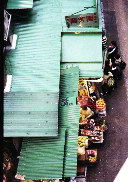
Mongkok is rather good for that sort of thing.
For example, the rectangular green grids of this candy store window has a lomography edge to it, and all I had to do was to memorise where the framelines of my beloved Leica M6 would be and wait until someone walks into the frame. Check out the reflections and the Chinese characters – they’re there and yet not so overwhelming:

The diagonal lines were calling out to me as I was on a bridge:

And finally, I like the grungy and yet contemplative mood this evokes:

And I’m keeping a close watch on my diminishing supply of Kodak Portra 400 film with which these were taken…
Thanks for coming by today.
