If you’ve read the previous 3 posts, you’ll know that the photographs below were in some of those posts, though they are in color here.
Yes, my B mode (berserk mode) in the cable car.


Monochrome is a gift to the street photographer, because:
i) it removes distracting elements and focuses our attention on the theme and/or graphic elements such as lines/grids/repetitions;
ii) it provokes a knee-jerk reaction to do with aesthetic pretensions (ooh b/w, therefore it must be seriously worthy/arty/historical/documentary);
iii) there’s virtue in taking the minimalist less-is-more approach.
But sometimes, less can be less as well.
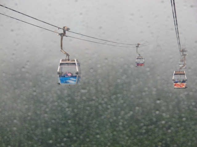
Slightly contrasty colors can be striking.
Here’re the cable car exhibits (which my wife said looked like Ultraman heads).


While we’re on the subject of superheroes, it’s hard to resist that Superman blue and red combo.

Blue and red combo again.

Slightly desaturated colors can be … poetic.
Colors could mark our different kinds of spaces.
Colorful below, black and white above.
There’s a statement here to be made about human colors vs religious monochrome.

The colors below look Kodak Ultramax -ish to me.


Anyway, there’s a tussle here of course, and you could say the photograph in color is not the same as the one in monochrome.

This one below looks Kodak Portra – ish. (Yes, yes, I miss my film cameras already.)

Of course, there are various kinds of monochrome (low vs high contrast, different filters, etc.).
Not to mention b/w vs colors as in film photography.
Photography is a universe in itself.

Until next time.

the top 2 images are beautiful 🙂
Thank you! 🙂