Fuji Superia Venus 800

I usually do very little post-editing, leaving the quality of the film to sort itself out.

IMG_20140605_0039 640

But the colours can turn out to be so very different from one exposure to another.

All images here are done with my Contax TVS, with Fuji Superia Venus 800.

IMG_20140605_0040 640

The above looks so lomography-ish.

I suppose lomography is point-and-shoot film photography write large.

IMG_20140605_0049 640

Then you have this, which seems a bit warm.

And then this:

IMG_20140605_0050 640

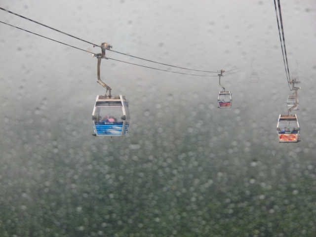
Greens and blues are rather saturated, with a gritty look to them.

IMG_20140605_0056 640

I waited a bit for the green canvas to be spread out, and was spotted.

So I smiled and waved, trying very hard to look like a silly tourist befuddled by his camera.

Oh look – yummy lychees!

IMG_20140605_0062 640

And here, the colours are muted.

IMG_20140605_0057 640

I was hoping for a silhouette effect.

IMG_20140605_0051 640

And then I switched off my camera, turned it on again, and forgot to de-activate the auto-flash function.

The flash went off less than 2 metres from him. He looked at my camera, and didn’t react…


I figured he must be deep in thought, or was he looking at something else…

IMG_20140605_0064 640


For collectors: open edition prints from this post are available here.


Ngong Ping Cable Car IV

If you’ve read the previous 3 posts, you’ll know that the photographs below were in some of those posts, though they are in color here.

Yes, my B mode (berserk mode) in the cable car.

IMG_7017 640

IMG_7019 640

IMG_7055 640

Monochrome is a gift to the street photographer, because:

i) it removes distracting elements and focuses our attention on the theme and/or graphic elements such as lines/grids/repetitions;

ii) it provokes a knee-jerk reaction to do with aesthetic pretensions (ooh b/w, therefore it must be seriously worthy/arty/historical/documentary);

iii) there’s virtue in taking the minimalist less-is-more approach.

But sometimes, less can be less as well.

Slightly contrasty colors can be striking.

Here’re the cable car exhibits (which my wife said looked like Ultraman heads).

IMG_7116 640

IMG_7119 640

While we’re on the subject of superheroes, it’s hard to resist that Superman blue and red combo.

IMG_7130 640

Blue and red combo again.

IMG_7131 640

Slightly desaturated colors can be … poetic.

Colors could mark our different kinds of spaces.

Colorful below, black and white above.

There’s a statement here to be made about human colors vs religious monochrome.

IMG_7154 640

The colors below look Kodak Ultramax -ish to me.

IMG_7260 640

IMG_7261 640

Anyway, there’s a tussle here of course, and you could say the photograph in color is not the same as the one in monochrome.

IMG_7179 640

This one below looks Kodak Portra – ish. (Yes, yes, I miss my film cameras already.)

IMG_7258 640

Of course, there are various kinds of monochrome (low vs high contrast, different filters, etc.).

Not to mention b/w vs colors as in film photography.

Photography is a universe in itself.

IMG_7338 640

Until next time.